

This was the very first assignment I did that was directly connected to my major. Our task was to create icons for our favorite household items. For my theme, I selected tea since I drink plenty of it and nearly always have a cup handy while working.
Surprisingly, spacing each of the elements was relatively easy thanks to the
reference photos and sketches I made before beginning.
These are lost to time but they exist I promise!

Once I got comfortable with the how to use the tones I started playing with line weighting to find what fit best
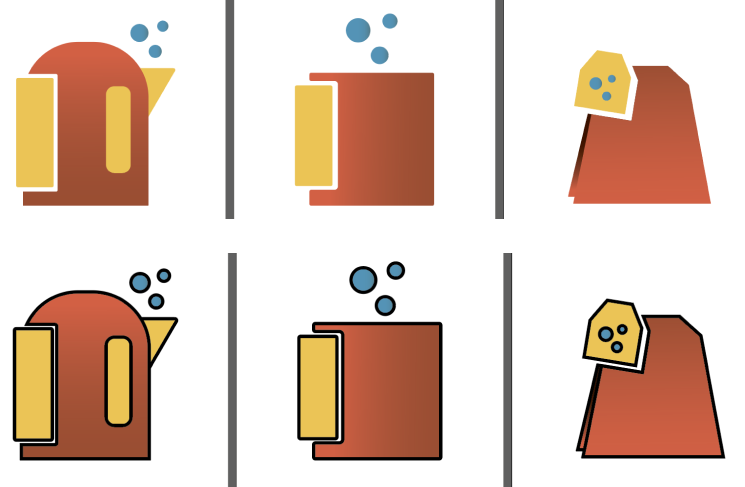
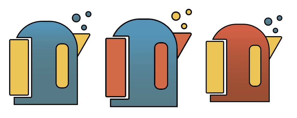
As per usual, I felt that I was on the right track but something was missing with the colour palette
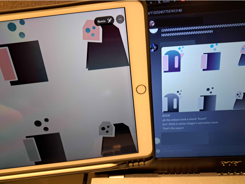
Thankfully, I have peers that love offering feedback. While on call they tried colour grading my icons
to see if other palettes would look better.
Needless to say, they did.
In the end, I settled for a more vibrant colour palette that i could imagine on a website or hoodie. Learning Adobe Illustrate through this and class activities was irreplaceable experience.