
The personal brand design assignment forced me to work with another student to bring their story to life. My partner was a self starter and had a myriad of interests from handicrafts to digital design. This gave me a wide berth to explore ideas, leading to the creation of my favorite designs.
The project consisted of 4 sections.
1 - Client Interview
To begin, we had meetings with our partners to learn more about them.
Going into this I had two goals.
1 - Genuinely learn about my partner’s personality.
2 - Find something about their story to tie to their design.
Thanks to setting these goals before the interviews, organizing the information was much easier.
Notable parts of the interview included my partner’s self taught skills, and a certain sculpture they created of people walking toward a hole in the palm of a sculpted hand.
When asked about it, they told me it represented how
we all age yet walk toward the same end.
A little dark, but inspiring nonetheless
2 - Logos
Following our discussions, the real work started. There are too many iterations to show them all, but all here a few of the biggest checkpoints.
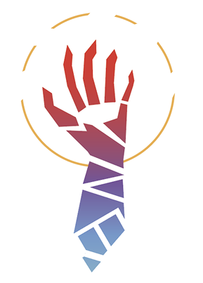
Phase 1 - Chosing the Shape
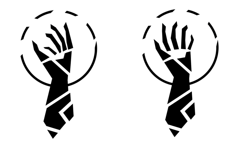
This phase had me playing with angles, rotation, backgrounds and the amount of fragment in the design.
It’s important to note that i had not decided on the line
“Out of Many, One”
at this stage. I was simply throwing ideas at the canvas
until I found my bearings.
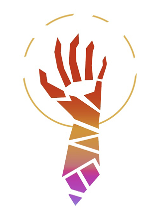
Phase 2 - ONE
In a stroke of inspiration I remembered the Latin phrase “E pluribus, enum,” or in English, “Out of many, one.”
This phrase felt fitting considering my partner mentioned her varied experience with handicrafts.
I also made a number of improvements in the hand, making th hole in the palm more ovular, the thumb more angular and other small changes.
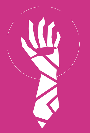
Phase 3 - Kaleidoscope
This was by far the most painful part of the assignment.
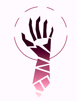
Countless different colour palettes and saturation levels as I inched closer to what felt right.
Eventually, I took a break.
Staring at the project for hours on end was not helping it’s progress and i felt like i was running in circles.
I knew what vibe i wanted, but i couldn’t hit quite right....
That is until my friend started playing Alto’s Odessey on a discord call
Problem was where the focus was, not necessarily the palette.
With the adjustments, the fingertips draw the eyes upward rather than to the base as with other designs
3 - Mockups
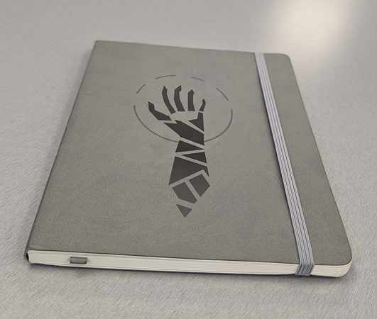
Not much to be said aside from that this quick exercise reinforced that small changes can have large effects when used properly
The mockups were simple, yet vital for testing our competency with Adobe Photoshop
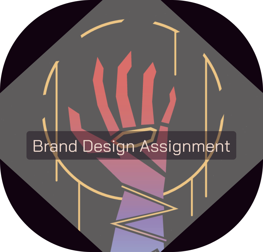
4 - Out of Many, ONE
In the final section of the project, we took on the challenge of creating a poster for the brand using our logos and feedback from the “client”.
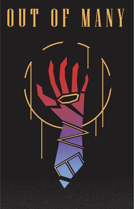
This was the biggest challenge of the project.
Getting the hand to look right on the background while avoiding a flat design caused me trouble for hours.
Only through the advice of my teachers and feedback of my peers was I settled on the gold inlay and drip from the ring
I believe this collaboration and iteration only makes the tagline of the project sweeter.